A small Apple UX failure that perfectly explains a bigger one
I make maybe three phone calls a day. Two of them are to my husband.
He is favorited. He is pinned. He is saved everywhere iOS allows. And yet, calling him requires five separate taps across multiple screens.
This isn’t a bug. It’s a design decision.
And it’s emblematic of a deeper problem in Apple’s UX culture: optimizing against edge cases while punishing real behavior.
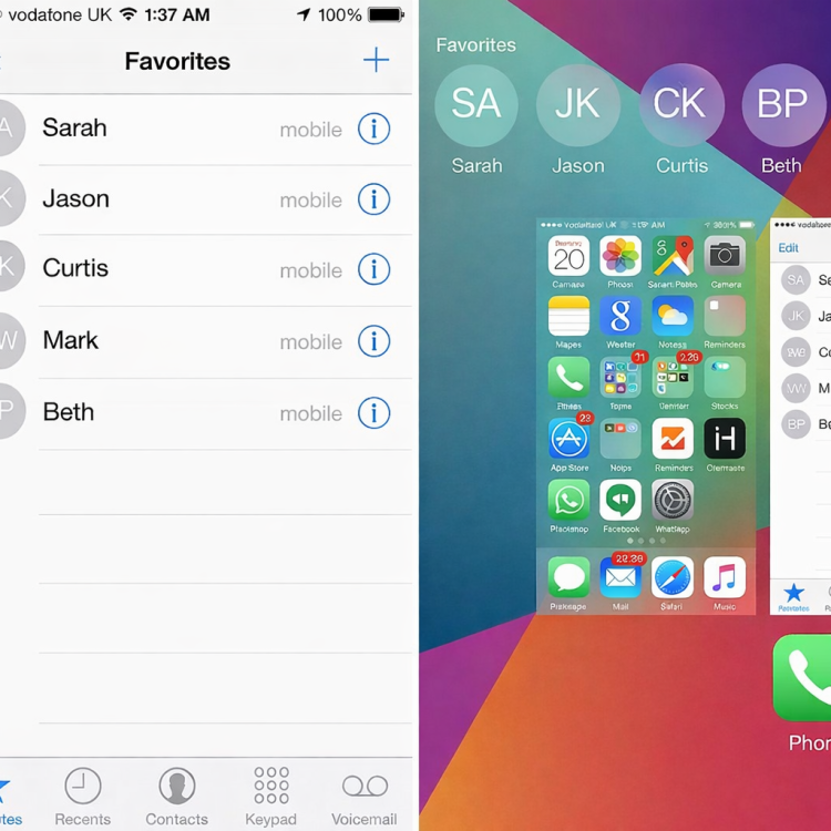
The real-world scenario
I unlock my iPhone. I want to call my husband.
Here’s the current path in iOS:
- Open the Phone app
- Navigate to Favorites (or Recents, or Contacts — all equally bad)
- Tap the contact
- Tap a small icon or submenu
- Confirm or wait for a UI transition
- Finally — the call starts
That’s five taps to perform the most common, intentional action a phone exists for.
This used to be solved
Apple solved this problem years ago.
- “Favorites” used to mean tap = call
- Contact cards surfaced primary actions clearly
- Muscle memory was respected
- Regressions were rare and treated seriously
Today, Apple treats accidental taps as the cardinal sin — even when the user’s intent is obvious, repetitive, and deliberate.
Calling your spouse should be easier than calling a stranger, not harder.
Apple optimized for the wrong fear
Modern Apple UX feels shaped by one anxiety:
“What if the user accidentally does something?”
So Apple adds:
- confirmation steps
- buried icons
- secondary menus
- ambiguous tappable regions
What they remove:
- speed
- intent recognition
- confidence
- flow
This is how you get a phone that is terrified of placing phone calls.
The workaround proves the failure
Here’s the punchline: I fixed the problem myself.
I added a Single Contact widget to my Home Screen.
Now calling my husband takes one tap.
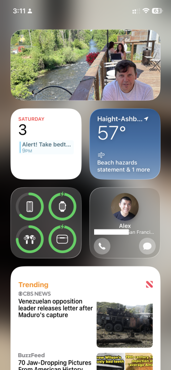
The fact that this workaround exists proves two things:
- Apple knows the correct interaction model
- Apple refuses to make it the default
If a widget is required to restore a core phone behavior, something has gone very wrong upstream.
This isn’t a “me” problem
I’m not disabled.
I’m not confused.
I’m not new to smartphones.
I’m exactly the user Apple claims to design for:
- daily phone user
- long-term iOS customer
- someone with one or two high-frequency contacts
And yet my primary action is buried under friction designed for someone else’s hypothetical mistake.
Multiply this by a thousand tiny regressions, and you get what iOS increasingly feels like:
polished, pretty, and quietly hostile to lived behavior.
Why Apple doesn’t catch enough flack
Apple avoids criticism here because:
- Reviewers focus on new features, not regressions
- Power users silently work around the problems
- Each issue is “minor” — until you live with it daily
No single tap is outrageous.
Five taps, every day, forever? That’s design debt.
What should have happened instead
A sane default hierarchy would be:
- Favorite contact → tap = call
- Long-press → other actions
- Widgets and shortcuts → optional accelerators, not fixes
Primary intent should never be hidden behind safety rails meant for edge cases.
Apple should hire people who get annoyed by this
I’m not joking when I say this:
Apple needs more people who feel physical irritation when common actions are slowed down.
People who ask:
- “What’s the most frequent action here?”
- “Why is the primary verb hidden?”
- “Who are we protecting, and at whose expense?”
Because right now, Apple is protecting itself from embarrassment — and billing users in taps.
The quiet truth
Calling my husband is faster from my lock screen widget than from the Phone app.
That sentence should embarrass someone in Cupertino.
Epilogue: The fix Apple won’t ship
Until Apple restores sane defaults, I’ll keep my one-tap widget.
But I shouldn’t need a workaround for love.